Case Study
CANVAS (REDESIGNED)
Adapting Canvas's existing features to reflect real student workflows: with more intuitive deadline tracking organized by course, easy to-do check-lists, and options to clear irrelevant notifications.
Tools used -
Figma · Google Suite
Timeline -
3 weeks
Team -
3 Designers (including me!)

Overview
Context
Canvas is a widely used educational platform, designed to facilitate course management in digital learning
The Goal
Designing to support student engagement and reduce friction in student workflows
My Impact
Led UX research, interaction design, and high-fidelity prototyping
Research
Students struggle with the current task organization system
To better understand how students currently manage coursework in Canvas, we conducted contextual interviews with eight undergraduate students across four majors.
I found that on paper, Canvas's To-Do and Calendar pages do exactly what they're supposed to: list every assignment, exam, and deadline across every enrolled course. However, the system required high mental effort to interpret and prioritize a growing list of tasks.
Participants explained that they rarely relied on the To-Do page as their primary planning tool: with several students having adopted external systems such as paper planners or separate calendar apps, using Canvas only to verify due dates.
So, I asked myself: Why is that?
Insights
Key pain points: Information accumulation and hierachy
From our research and user interviews, I discovered two recurring pain points:
Information accumulated without resolution
Assignments, reminders, and deadlines from every course remained visible indefinitely, creating an ever-growing list with no way to dismiss or archive completed work.
Everything carried equal visual weight
An assignment due within the hour appeared identical to one due weeks later. Because Canvas offered no hierarchy or prioritization, students were forced to repeatedly determine what deserved their attention each time they opened the page.
This pointed out that, rather than being a visual design issue, the opportunity centered on reducing cognitive load and rebuilding students' trust in their planning tools.
Define
Students' naturally group assignments by course NOT by due date
When students described their workload in the interviews, they consistently framed their week in ways such as, "I have a problem set for one class, a discussion post for another, and something due in lab."
Their mental model prioritized course context first, then time.
Canvas, however, organized tasks in the opposite way—combining every assignment into one chronological list regardless of course.

Design
Exploring
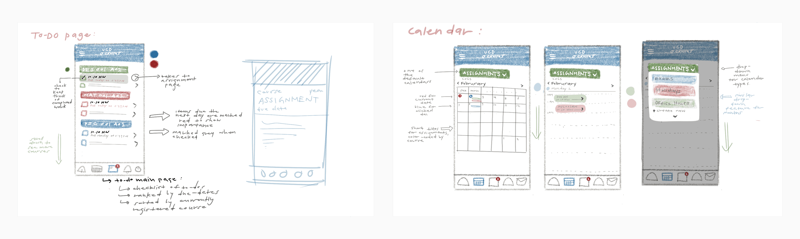
Rather than redesigning the task list itself, I explored how reorganizing existing information around students' mental models could make planning feel more intuitive.
Our proposed solution introduced collapsible, course-based task sections that allow students to focus on only the classes relevant to that moment while reducing visual clutter from the rest.
Design Consideration
Blending new ideas within an existing system
An important constraint throughout this project was designing within Canvas's established design system. As a widely adopted platform, Canvas already has recognizable interaction patterns and visual conventions that existing users understand.
Rather than redesigning the product from scratch, our goal was to improve one specific workflow while preserving the familiarity of the overall experience.
Throughout critiques, we used a simple design principle: every new interaction should feel like a natural extension of an existing Canvas pattern. If a solution introduced unnecessary complexity or required users to learn entirely new behaviors, it was removed.
Working within Canvas’s established design system, we leveraged existing elements across the platform while also introducing a new task management structure, to create an improved yet cohesive and familiar experience for users.
The Final Design
CANVAS REDESIGNED:
Supporting the ways students already organize their academic workload
By reorganizing existing course information around students' mental models, the redesigned experience helps students:
See priorities at a glance through collapsible course-based sections instead of one continuous task list.
Reduce visual clutter by allowing completed or irrelevant tasks to be dismissed.
Plan more holistically by combining academic deadlines with personal schedule entries.
Build confidence in the platform by surfacing only the information that remains relevant.

Reflection
Learning that effective design is not always about adding new features.
This project changed the way I think about designing within constraints, and served an exercise in intentional design.
The most valuable insight for me wasn't the collapsible sections or the ability to dismiss completed tasks. It was recognizing that Canvas already possessed the right information—it simply organized it differently than students naturally think.
Rather than introducing entirely new functionality, this redesign reorganized existing information to better align with students' mental models. It reinforced an important lesson for me as a designer: effective design isn't always about adding features—it's often about reducing cognitive effort so users can accomplish their goals with less thought.