Case Study
COVE
Centralizing the end-to-end volunteer experience: from discovery to registration and event tracking. Specifically matching volunteers with personalized event recommendations to make giving back effortless and meaningful.
Tools used -
Figma · Google Suite
Timeline -
6 weeks
Team -
1 PM and 4 Designers (including me!)

Overview
Context
Volunteering is a greatly meaningful experience, but despite the abundance of opportunities, many find it difficult to find an opportunity that suits them
The Goal
Create a seamless experience connecting volunteers to events that align with their ambitions
My Impact
Shaped product direction through research, designed key user flows, and iterated based on user feedback
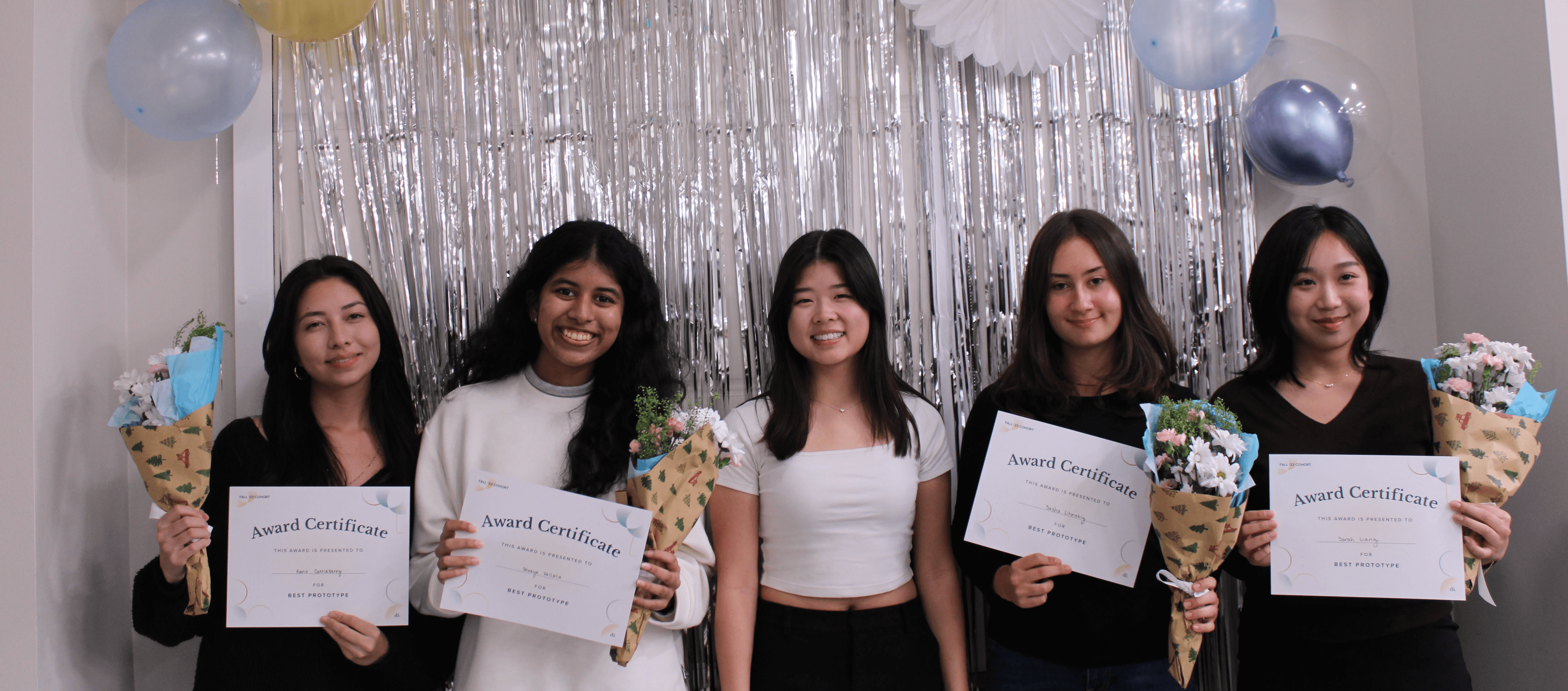
🏆 "Best Prototype" Award!
We won "Best Prototype" for this project, competing against 4 other designer teams.
Research
Myth: Lack of opportunities is the reason why students don't volunteer.
When our team first began exploring the space, it was easy to assume the problem was availability. If students weren't volunteering, maybe there simply weren't enough opportunities being shared. But, research quickly challenged that assumption.
Volunteer events already existed across university community boards, nonprofit websites, student organizations, Instagram posts, and word-of-mouth recommendations. The opportunities were there, they were just scattered. Students often found themselves jumping between websites, comparing events with different levels of information, opening tab after tab before eventually abandoning the search altogether.
The problem wasn't a shortage of opportunities. It was the experience of finding one worth committing to.
Insights
Decision fatigue bottlenecks the number of active volunteers
Rather than designing around assumptions, we wanted to understand how students currently searched for volunteer opportunities and where that experience broke down.
Our team conducted interviews with more than 50 undergraduate students, asking them to walk us through how they found volunteer work, what influenced their decisions, and what ultimately prevented them from participating.
While every student had a slightly different process, three patterns consistently emerged.
Discovery felt fragmented
Students relied on a mix of university websites, nonprofit pages, student organizations, social media, etc. None of these sources talked to one another, forcing students to search across multiple platforms just to understand what opportunities were available.
Information wasn't helping students make decisions
Even after finding opportunities, students struggled to evaluate them.
Some listings explained almost nothing beyond a title and date, while others buried important details in long descriptions.
Students wanted opportunities that felt personal
Students weren't looking for just any volunteer experience. They wanted opportunities connected to causes they genuinely cared about and communities they wanted to support.
The more relevant an opportunity felt, the more likely they were to follow through.
This feedback confirmed students didn't need another place that listed volunteer opportunities. They needed a platform that made discovering the right opportunity feel effortless.
Define & Low-fidelity
Designing for a continuous volunteer journey
Building on our interview findings, I refined our design goals. We prioritized bringing opportunities into one centralized experience, helping students discover events relevant to their interests, reducing the number of steps between discovery and registration, and making it easy to keep track of commitments afterward.
Those principles evolved into six primary experiences: Home, Search, Direct Messaging, Calendar, Profile, and Onboarding.
Rather than treating these as separate features, we viewed them as parts of one continuous volunteer journey—from discovering an event to showing up for it.

Our early wireframes weren't about creating polished screens, they were about testing ideas before becoming attached to them.
We iterated through several homepage layouts, continually asking ourselves one question: Does this actually make discovery easier?
As the product became more refined, we moved into mid-fidelity prototypes and usability testing. That's when one piece of feedback completely changed the direction of the product.
Pivot
Rethinking the design and cutting out repetitive features
During usability testing, participants repeatedly moved between our "Home" page and our "For You" page without understanding why both existed.
From our perspective, the distinction seemed obvious: ""Home" highlighted overall activity, "For You" emphasized personalized recommendations. But users didn't experience those differences. To them, both pages surfaced volunteer opportunities. Both felt personalized. Several participants even revisited information they'd already seen because they assumed they had navigated somewhere new.

Instead of trying to further distinguish two similar pages, I asked myself if these pages should even be separate experiences.
We ultimately decided to merge Home and For You into a single destination with sub-tabs: one focused on recent activity and another on personalized recommendations, this way all discovery was placed on one page.Though it was a significant change late in the design process, it immediately simplified navigation and reduced confusion.
More importantly, it reminded us that users don't experience products through design documentation. If two pages serve the same purpose in a user's mind, no amount of labeling will make them feel different.
The Final Design
COVE:
A centralized hub for volunteer discovery, matching, registration, and tracking
The final product centered around five connected experiences that supported students throughout their volunteer journey.
Home
A unified discovery experience combining personalized recommendations and recent activity into one destination.1
Search
Allows students to browse organizations, causes, and volunteer opportunities using filters that reflect what matters to them.
Direct Messaging
Supports communication between volunteers and organizations, strengthening the sense of community beyond registration.
Calendar
Keeps registered and saved events organized while helping students avoid scheduling conflicts.
Profile
Stores volunteer history, preferences, and saved opportunities, allowing recommendations to become more personalized over time.
Supporting all of these experiences is a short onboarding survey that captures interests and location from the very beginning, enabling recommendations that feel relevant from a user's first session instead of weeks later.

Reflection
Talk early, talk often
Upon approaching this project, I assumed the biggest challenge would be organizing volunteer opportunities into a clean, intuitive interface. Instead, I learned that good UX starts much earlier, by making sure you're solving the right problem in the first place.
Research shifted our focus from increasing access to improving discovery. That single reframing influenced nearly every design decision that followed, from prioritizing personalized recommendations to simplifying how users explored opportunities. It was a reminder that strong design isn't about adding more features; it's about removing the friction that keeps people from acting.